CHALLENGES IN MOBILE WORLD
The media environment has quickly transformed to become mobile friendly. The wireless connections are being introduced in new parts of the world, the connections are better in quality and speed, and the contracts to use them are getting cheaper. It is estimated that by year 2020 there are 3,6 billion smartphones in the world. It will be the main device to access information and reach out to others socially. [1]
But still, for visual storytellers, digital world means constant balancing between slow connections, small screen sizes and eye-catching content. Many of my interviewees stated that thinking mobile is harder when visualising news, but at the same time the challenge makes the end-product smarter, simpler and in a way more polished and considered. Nelson Hsu from NBC:
“I think as a creative person you do feel a little more restricted just because of the space, but I think as a storyteller it actually improves your storytelling. Mobile forces you to really just figure out what’s important and take out the rest of the stuff that could be just decoration.”
The New York Times’ Larry Buchanan admits frustration while acknowledging the benefits of mobile thinking:
“Mobile screen seems initially a huge challenge, you only have a couple of hundred pixels to back a lot of information in. And that for a while, coming from a world of gigantic beautiful print graphics, to shrink down to a tiny stupid phone, was kind of frustrating. But in a lot of ways it makes us simplify and be clearer and be quicker, and not waste much time. So, in a lot of ways it’s good and liberating to think about the phone version first. Thinking about where the phone is good at, and to think about how someone’s gonna interact with it.”
The subtitle of this study, “Embracing the boundaries”, comes from the following quote from Chris Meighan, who has been working with his team in new visual news environments for almost a 18 months:
“I mean, it can be hard, it’s definitely challenging. That’s everyone’s accessing the content [via mobile phones] so we try to look at it as a unique challenge. And what we can do within that small screen that can be provocative or can grab it on a reader. The audience balance is so much further mobile than it is desktop, you just have to embrace it. Once you get pass the mental hurdle of it all, I don’t think is that big of a challenge. It’s changing a mindset.”
The Pudding’s Matt Daniels thinks that for him, as an online-only visual story creator, the challenge with mobile is easier than for a designer that comes from a traditional news organisation. They have the possibility to choose which platform they want to make their stories work on:
“We have the luxury of choosing. But if you work at the New York Times or the Guardian they are trying to build stories that everyone reads in whatever setting or an environment that they happen to be in. Or if you’re at the BBC, you’re trying to reach as many people as possible, so you’re building for all screen resolutions. — It can be really challenging when it’s something like election results that need to reach every outlet because you want to reach everyone possible.”
Power of the platforms
Google, Amazon and Facebook have become delivery mechanisms for news and journalism, says journalism lecturer Sue Greenwood (Routledge, 2018, 27): “Just as once the delivery mechanism was newsprint, and then it became radio and newsprint, and then the radio and TV and newsprint, now it is search and social and internet and radio and TV and newsprint.”
The young generations started to adapt to social media early, but now also the older generations have found their way there: 55 percent of American adults over 50 are consuming news on social media sites, up from 45 percent in 2016. Of all adult Americans 67 percent rely on social media platforms such as Facebook, Twitter and Snapchat for news. The increase was five percent from year 2016.
But it seems that the growth of using social media for news has stopped and has already started drop in the markets like United States and UK. Reuters Institute Digital Report shows that last year 51 percent of US news consumers said that they access news via social media, this year the weekly social media usage for news came down 6 percent. The decline in United Kingdom was 3 percent, and is now 39 percent. [2]
The decline comes mostly from Facebook, since its use as a news source has declined almost in every market. But it is also notable that Facebook has changed it’s algorithm to show less news and more personal and social content in users’ newsfeed. Digital News Report 2018 reveals that Facebook referrals to news sites have dropped significantly after the two major algorithm adjustments.
Many of my interviewees were not too worried about, for example, social media’s power to cut them off from markets. One reason for not panicking with recent algorithmic changes in Facebook’s newsfeed is also due to the fact that the news media believes that social media need their content. They are also not that dependant on the platforms as a main source of traffic. Their readers find their brands without too much aggregation and they are already using their apps as news source.
Sam Joiner from The Times thinks that you should not trust platforms too much:
“I think the one thing that The Times has always been aware [of] is that changes by these big monolithic companies, like Google and Facebook, have a massive impact on the way you rank and how your stories appear. So you gonna have to have a product in your own right, you gonna have to have a website in your own right, otherwise it doesn’t take them a lot to change for you to be in serious trouble.”
Amanda Farnsworth from the BBC also believes that predicting is difficult when talking about social media environment:
“The audience can just change. Who knows how popular social media networks, that seem to be huge today, in five years’ time will be? I don’t know. Will we all be talking to our devices in five years, not touching them or swiping them?”
The Guardian’s Theresa Malone sees presence in social media being more [about?] marketing and building a brand.
“I think in terms of being dependant on social is a way of reaching audiences, and we want to showcase the best of our journalism. — Showing audiences what the Guardian is about and hopefully converting that to a loyal audience. — We’ve had a lot of growth in our Instagram following over the past year. And it’s been exciting and liberating, to experiment with new formats that work natively on Instagram, like with Instagram Stories to be able to tell stories in a new way, in sort of a fresher way. In more digestible but also meaningful way.”
Despite its uncertainty, presence in social media is considered to be worthwhile – and visual. That gives for example the BBC’s social media team a chance to engage younger and female audiences. Amanda Farnsworth tells that their social team have a special mission to reach to audiences who have not traditionally consumed BBC news that much:
“We just did a big piece of work about what actually appeals to the underserved audience in particular, by which I mean younger, less-well-off, ethnic minorities, more women — and therefore those of us who are working in newer parts of the news sphere, like social media, we have a particular mission to try to appeal to them. That’s a lot to do with kind of topics you cover, and it’s about how you cover them.
Another broadcaster, NBC News, has been successful with its attempts to attract more younger audience in Snapchat Discover. Their twice-a-day news show Stay Tuned gained audience of 4 million subscribers in five months after launch in August 2017. NBC News says that more than two-thirds of the subscribers are under the age of 25, and more than a half of them watched three or more episodes per week. The success tells that social media could be used effectively also as a news channel for video format news.[3]
The Washington Post values co-operation with platforms
The Washington Post says it is absolutely crucial to be present in new platforms, and his team of merging products also leads that co-operation with platforms. Director of that team, Chris Meighan, thinks that relationship with the platforms means that newsrooms are heard during the development. By collaborating with platforms they might have a say in the process.
Meighan’s team and the Washington Post’s engineering department work nowadays together with the AppleNews, GoogleNews, Facebook, Instagram and Snapchat. They are continuously looking for new companions: e.g. they recently made an integration with Uber. Meighan says it is beneficial for all:
“In general, we’ve been a pretty good partner with companies like Google. Whenever these companies want to try something new, we’re game to do it and see how it works out. I think that [AMP story format] is a great example of something that’s very different from what’s out there, and we’ll see how it is going forward.”
The Washington Post is one of the newsrooms co-operating with Google in AMP project. Other newsrooms working with Google in the project include the CNN, Conde Nast, Hearst, Mashable, Meredith, Mic and Vox Media. AMP is an abbreviation for ‘accelerated mobile pages’ and means quickly loading standard for mobile webpages. The company itself describes the stories as “mobile-focused format for delivering news and information as visually rich, tap-through stories”[4].
Of their partners, AppleNews has become an important source of traffic for the Washington Post, says Meighan:
“We run our presence on Apple News, part of that is brand building, part of it is subscriptions. — We are also trying to talk to a different type of reader there and expose us to them. Underlying factor is that we are always trying to build an audience, and how we do that is depending on those platforms.”
Also being present in Snapchat Discover is also an investment in the future, according to Meighan:
“In Snapchat we’re introducing Washington Post content to a whole new generation of readers, a huge part of our audience on those platforms is from 13 to 25. And there’s nowhere else that we can reach an audience like that. So it’s kind of like building a daily habit. We’re interacting with a lot of readers who might not come to us, so what we are trying to do is to go where they are and then get them eventually start coming to us.”
Can trust be improved through design?
Knowing your audience is crucial, but you cannot undermine the importance of audience knowing you. According to the Reuters Digital News Report 2018 (Newman et al. 2018), people access news more via side door routes like search, social media, email links or news aggregators than by landing to the site directly. The number of direct access was only 32 percent compared to 65 percent via other routes.
This creates challenges to news organisations’ brand attribution and recognisability: Less than half could remember the name of the news brand for a particular story when coming from search or social media. When the news story was found via search, brand attribution was even lower, just 37% compared to 47% from social media. [5]
Engagement and trust is the thing that everybody is talking about now. News organisations need loyal readership that keep coming to them, and building brand is important in that. News media does not go after clicks as it used to, but they need people to identify as a part of papers community. The New York Times 2o2o Report verify that advertisers, too, seek that identification: “Advertisers crave engagement: readers who linger on content and who return repeatedly. Thanks to the strength and innovation of our journalism — not just major investigative work and dispatches from around the world but also interactive graphics, virtual reality and Emmy-winning videos that redefine storytelling — The Times attracts an audience that advertisers want to reach.”
The New York Times believes that they can reach the loyal audience by visual storytelling in digital form, so it was named as the number one goal in their news production. Their 2020 Report states: “We have defined multimedia storytelling for the news industry and established ourselves as the clear leader. Yet despite our excellence, not enough of our report uses digital storytelling tools that allow for richer and more engaging journalism.” [6]
Adopting new storytelling formats also portraits a news media as a dynamic and forward-looking organisation. Nelson Hsu thinks that new forms of storytelling play an integral part in branding of a news media:
“As broadcast company, if you want to be projecting yourself as like very forward thinking, you want to do more than just a straight up video. You want to create experiences like interactive video, a non-linear video and that would involve another visual and a more digital experience than just sitting back and watch.”
For a public broadcaster, too, visual storytelling has enormous brand value. BBC’s Amanda Farnsworth believes that it has a positive effect on their already trusted brand.
“Doing very engaging and highly visual content on mobile for BBC does send a message that BBC is, although it’s got a wonderful tradition and many decades of broadcasting and digital experience, a forward-looking organisation that does modern content that’s relevant to people’s lives.”
Amanda Farnsworth continues with a real-life example of relevance: she thinks that building a personalised and local tool for tracking NHS health services is in the center of what the BBC should be doing:
“I think they [visuals] do have special value, because if we weren’t doing it, we wouldn’t be doing a very important part of what people expect to get in terms of content from a news organisation. We just wouldn’t be in the game on lots of different areas. I think particularly our original data journalism has been a huge audience value and therefore a value to the BBC. I think some of our biggest projects go right at the heart of what the BBC is all about.”
- Know what is a good story
- Bring the visualist to the table
- Collaborate
- Keep it small, simple and vertical
- Talk code – no need to write it yourself
In a handbook for interactive data visualisation Ward, Grinstein and Keim (2010) note, that sight is our key sense for understanding information. They state that a picture is more powerful in delivering information than text “because image interpretation is performed in parallel within the human perceptual system, while the speed of text analysis is limited by the sequential process of reading”.[1]
The Oxford dictionary explanation for ‘visualise’ comes close to acknowledging the role of the content and how to make is more understandable via design: To visualise is to “form a mental image of; imagine.” “Make (something) visible to the eye.”
Designers in media industrytypically do not differentiate content from design: if you don’t have anything to say, design can’t save it. Visual storytellers emphasize their role as journalists, as deliverers of the content.
1. Start with a story
Without content, there would be nothing to design for, so every news story should start with an idea of a story. All of my interviewees emphasised the meaning of the story for the process. Amanda Farnsworth puts that into words:
“I think first and foremost any piece of journalistic content starts with the story and if this is a good story, is this something compelling that people are going to know about. So topic is very important. I don’t think it changes whatever platform you are doing your piece of content on.”
The Puddings Matt Daniels thinks it is also important to have a sense of how the story is told on the screen:
“You’re having a good sense of story, understanding how readers will perceive the work that you’re making, whether what you’re trying to say is actually being said on the screen or whether there is actually a big gap between what’s in your head and what’s actually on the page and being aware of that.”
My interviewees widely agreed that lately, visual journalists have more value as a storytellers themselves, nowadays. Sam Joiner, the editor of The Times interactive team, confirms this:
“I think everybody who works here would say they are journalists. They might not have been a reporter, they might not have been writing stories. But they are journalist in that they should know when a story is a really good story, and I think everybody needs those reporting skills. In the same way, I think if you can think visually or even be able to understand your data better, you are a much better reporter.”
David Yanofsky sees that, in addition to knowing what is a good story, you also have to know the different ways to
“We want to serve our readers the best way possible, and if the best way is words, we should give them words. Or if the best way is through chart, we should give them a chart, or if the best way is to do map, we should give them a map. If the best way is through a whole interactive feature an hour-and-a-half width, then we should give them that.”
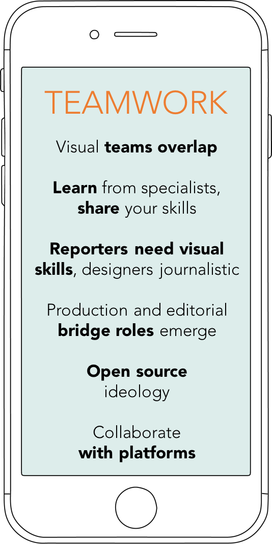
2. Collaborate
Collaborative work environment refers to collaboration between the departments but it also means mixing different backgrounds and skills within the team. This is done, for example, in the New York Times’ graphic team says Larry Buchanan, who works together with different visual teams in the newsroom:
“We have all of the people who have such broad skills and good ideas to make those decisions. We’re all sitting together, constantly talking, constantly working on many different projects, building a lot of trust. We don’t really put people into [silos]; there’s a programmer, there’s a designer, she’s a cartographer or whatever. Even though people certainly have expertise.”
Nowadays, the titles of visual professional working in newsrooms range from infographics and graphic designers to interactive designers and producers; some teams also have UX designers or they consult them. The BBC has also data journalists working in the visual team and The Pudding describe themselves as journalist-engineers. The Pudding’s co-creator Matt Daniels tells that they actually struggled describing what they do as visual storytellers:
“I think most titles are generally made up. We had a long debate about whether to go with visual journalist or graphics person or just like front end developer. We went with that, it’s not perfect. The idea was to work on with something explained what we did, closer to just something that already existed.”
Daniels’ puzzle captures what is happening in the newsrooms at the moment. Visual people’s roles transform and overlap considerably, and when new tools and skills are introduced, a graphic designer is too simplified a title to describe what these people actually do.
The New York Times graphics team solved the problem of job titles by simply calling everybody ‘graphic editors’. Skills vary, and people know who to go to when they need special expertise in the course of a production. Larry Buchanan explains their multi-layered working environment:
“There’s a lot of lines that are blurred at the Times. The graphics team itself is maybe like 30 or so. And then there’s interactive news department, that builds a lot of tools and goes with big data things, aggregating all of our elections data or Olympics data or data from the World Cup, they have a team but we co-operate with them, there’s the digital design team, which works on larger story build-outs and stuff like that, and we co-operate with them. And then there’s a video team, a photo team, a photo desk. And then there’s all the print designers and production people. So there’s a lot of visual things happening at the Times. And a lot of those are overlapping. We all work together depending on project.”
Amanda Farnsworth is the head of the multitalented BBC’s Digital Visual Team, which is a combination of a lot of different skillsets. TV people already know their way in motion graphics, whereas people with data journalism background might be savvier with infographic visualisations.
“One of the joys of the department having so many TV and digital people working together is that we share skills, we share information. People can go on attachment across platforms, and it’s worked very well.
Digital journalism requires a lot co-operation also in-between designers and reporters. The collaboration should start as early as possible. The idea for a visual story can come from anyone: reporters or editors are no longer the only ones entitled to pitch a story. The Washington Post reporters have often noticed how successful a visual story can be, and Chris Meighan have seen the journalists come to the visual departments a lot more than before.
“I have several visual journalists in my team who also can come up with their own story ideas, can write them, and work with editors together to put together really good stories. You’ve seen a lot more reporters starting to think about their stories from visual point of view. “
The Times’ Sam Joiner starts the storytelling process always with a brainstorming session with as diverse group of people from as many different backgrounds as possible: A senior politics reporter and UX designer could be sitting at the same table to reach the best possible outcome. This was done in their elections page 2017, and 60 % of people that landed on their page engaged with it:
“You’ve gotta have good ideas. That sounds really basic, but I think you got to think outside the box, think about how to bring things to life in that sense. — By not rushing and through prototyping ideas with people with expertise in totally different areas you get far more interesting ideas and results.”
The 2020 Report from New York Times states in its first paragraphs the following: “We need to expand the number of visual experts who work at The Times and also expand the number who are in leadership roles. We also need to become more comfortable with our photographers, videographers and graphics editors playing the primary role covering some stories, rather than a secondary role.”
Larry Buchanan verifies that the role of the visual department has been ever stronger after the strategy release, and they constantly work on their own story ideas:
“Vast majority of the stories come out of the department itself. Just conversations we’re having, things we’re interested in, we start to talk about. And then of course we work across all the other desks, with reporters to pull out visual angles to their stories.”
Buchanan says that they work hard on the visual take on stories because they are expected to contribute visually rich and sometimes stand-alone visual storytelling:
“What we do well is that we take the idea of visual journalism very seriously. — We approach it all as journalism and we approach it all as first-order-journalism. It’s not like: there’s an article and there’s a graphic that goes with it. If instead you think about the story and whether or not there is a uniquely visual angle or visual take, and take that part very seriously.”
The Washington Post’s Chris Meighan has seen the respect for visual teams growing lately, both in his newsroom but also outside the organisation:
“Traditionally ten years ago, way back, designers were kind of the last person at the end of the assembly line. That worked maybe for print, but not really a method of creating top-notch work.” (7:43) Even more so now, within newsrooms, good newsrooms, there’s an understanding that when you’re coming up with an idea for a story, or reporters are coming up with an idea for a story, there should be a visual journalist in the room so they all can start brainstorming early on.”
The Guardian’s graphics team encourages their developers and designers to create stories, Theresa Malone:
“I think one of the things that we’re really trying to do is to get the organisation to says embrace visual storytelling as a form of primary reporting in its own right.” (1st clip, 6:30) — We have developers who build things and code, we have designers. What we kind of aspire is to everyone being a journalist. So even the developers, we ask them to produce stories on their own, so they build them but they also are telling the stories.”
The both online-born publishers I talked to consider their work less collaborative in a way, that their designers normally start with their own ideas. They are self-directed and work on their individually preferred projects. The Quartz’ editor and reporter David Yanofsky works remotely from California, whereas the other two members of the Things team are in New York. There are also other people in the company who can produce visuals to their stories:
“That’s very deeply engraved in the Quartz, that there’s a lot of bottom-up reporters pitching their editors rather than editors assigning their reporters. A lot of my work is self-directed. But obviously from the point it’s guided by editors along the way.”
The Pudding’s creator Matt Daniels works alone on his own projects that he finds interesting, but also consults other members of the team. The Pudding wants to work on projects from its own point of view: that visual stories have a lasting impact on culture. This is why he started The Pudding (and the sister company Polygraph in 2015) concentrating on visual essays with his like-minded friends:
“The fact that it’s on a screen and not on paper, the possibilities are just a lot more different and you can do things that you couldn’t do before interactively. That just has opened the door for different types of storytelling. You can show all the data, you don’t have to distil it down to a 2 inch by 3 inch. — You can do visual lead stories where the story is the graphic, not the graphic explaining what is said in the story.”
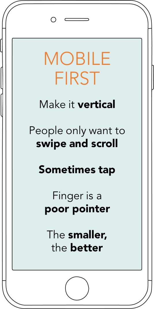
3. Keep it small, simple and vertical
The Quartz’ David Yanofsky thinks that the size of the mobile story is the first thing to look at. That means not only considering loading time in slower connections and how much loading would cost the customer, but also the physical size of the elements on the screen:
“The size [matters] not just in making sure that these things are legible at small sizes: the fingers are thick and the ability to touch or tap certain elements in a complex visualisation is much harder on your phone. And to that point, the location of interface features is important to understand. Our hands will be covering various parts of the screen. So making sure that if there is some visual thing that happens when you’re interacting with your phone, it is not under your finger or it is not under your palm.”
Because of the nature of mobile reading is mostly skimming, the storytelling experience on mobile has to be clean and easy to follow. The BBC’s Amanda Farnsworth stresses the importance of readers’ journey through the story on a small screen:
“It’s got to grab the attention on the small mobile screen, so I think that’s world away from kind of groovy desktop visualisations. — You have to think about people swiping and scrolling rather than clicking and pressing and touching. People don’t really wanna do that on their phone except when they are typing. Instead of hiding things behind tabs, it’s better to go next, next, next or scroll, scroll, scroll, scroll, scroll.”
People prefer to use their phone by scrolling the content, they also want to be in control of the storytelling, so anything that they didn’t wish to happen, they might find annoying. Swiping through vertical or card-like horizontal storytelling formats like Stories have got people accustomed to a continuous, linear storyform.
For example, readers find movement triggered transformations appealing to consume. They feel that they are taking part in the storytelling when something that they do – even a mere swipe – affects something in the storytelling. Immediate feedback feels rewarding, thinks Sam Joiner:
“People are very used to being in charge of what they see on their screens. You can do them in slideshows as well, actually quite often you have things that you tap through and information changes as you tap through. I think that’s really important, as well: giving the reader control of it and not overcomplicating your screen.”
Chris Meighan works mainly in the Washington Post’s apps and social platforms, so for him bold visuals, clean typography and animation are the main areas of concern. Also important is working together with the newsroom headline writing team, because everything starts with grapping the attention of a reader:
“You want to tell the story as quickly as possible. — Then making sure that it works well across all screens, and particularly our app feed and all of those different platforms on devices, so if we are designing something for iPad it also has to work on a watch. We’ve really done a lot of back and forth testing that we can make sure that the legibility is good. Because if it’s not, people won’t engage with your product on whatever that is.”
Vertical is the word of mobile world. As audience turned more social they became more reluctant to turn their devise in a horizontal, landscape position, even when asked. Social pictures and videos started to be vertical, and when the world’s most popular video streaming service YouTube – with over billion users world-wide – allowed square and vertical videos in the end of 2017, the trend was starting to be the rule.
Vertical storytelling has also taught people that storytelling does not end in the first screen the reader sees, and people expect something to happen when they start to scroll. Chris Meighan has a rule for keeping people interested throughout the story.
“We’ve put a lot of attention into the whole storyform, what we call down-page in the scroll. Because we try to get to the point where, if you’re scrolling out of mobile, every two scrolls you’re heading there’s some sort of visual in there, whether is a video, a quote, a photo or a graphic. There’s so much competition for people’s eyes, and once you get someone into the story, you really have to give more than just a cool animation at the top of the story. There needs to be a lot of attention to detail or you lose the readers.
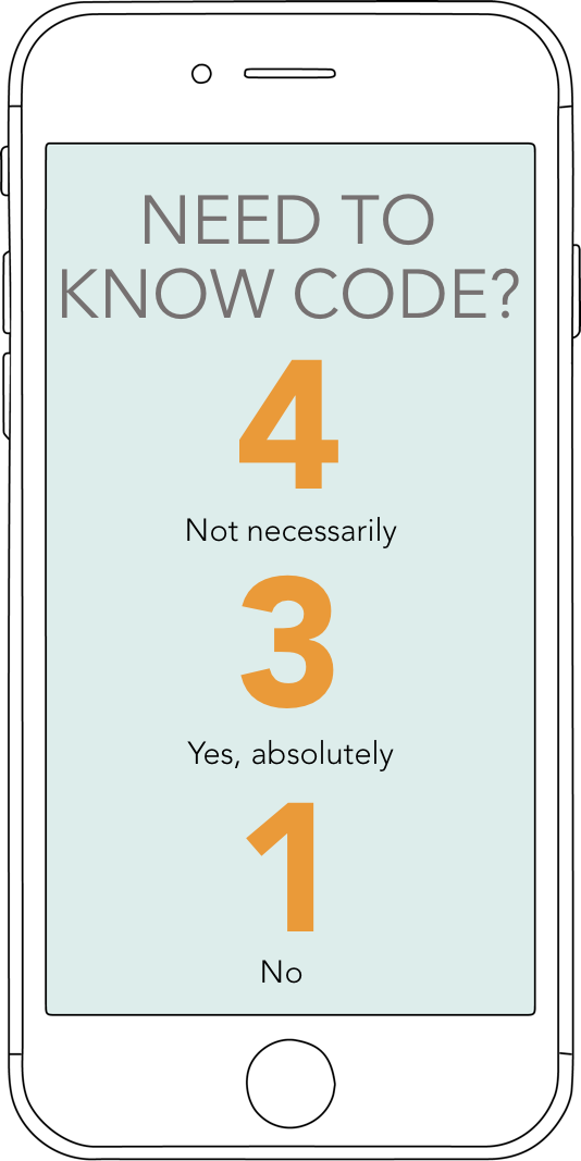
4. Know code
Is it crucial to know how to code, nowadays? Four of the interviewees stated you don’t necessarily need to code yourself, but the ability to speak with the developers about your ideas is essential. Knowing code gives you also ideas about what is possible on digital platform. Quartz’ David Yanofsky refers to the past when explaining the need to know the platform and how it’s working:
“Just like graphic designer benefits from knowing about printing processes and various limitations of certain kind of press, or certain kind of process, certain type of binding, certain kind of paper. Someone who is designing for the internet or any digital platform is best served by knowing the limitations of a web browser or screen sizes and the speed which the code can run and the complexity of certain tasks.”
NBC’s senior graphic designer Nelson Hsu thinks that mastering coding is essential for a designer.
“I think a visual storyteller definitely knows how to code, because you need to be able to know what the capabilities of a browser or of the phone are in order to be able to tell the story.”
Then again, you can learn by doing. For example the ability to code or being highly technical is not the first thing the Washington Post looks when hiring:
“We always look for designers who are very fundamentally sound. They don’t necessarily need to be able to code, because we feel like that we can bring them along in that area, we are just looking for top-notch visual storytellers. — It’s harder to find people who are just really great talented designers.”
The New York Times graphic team is depending on their own team in many cases when they need coding and developing skills. Sometimes they do not even need writers to do reporting, but also coders are not necessarily needed, says Larry Buchanan:
“It doesn’t work if you have to sketch something and then you have to ship to development people in different building or on a different floor… It’s not like that. We are all journalists, we can all pick up the phone, we can all do reporting, we can all write words. Some of us, well most of us, can write basic HTML, basic CSS, basic JavaScript.”
[1] Interactive data visualization: foundations, techniques, and applications, Ward, Matthew, Grinstein, Georges G, Keim, Daniel, 2010, Natick, Massachusetts : A K Peter
Best practises
of mobile visualisation
- Build tools for reporters – leaves more time to bespoke design projects
- Newsrooms are sharing their tools too, use them
- Open source tools are available for free
- Talk code – no need to write it yourself
The form of the visual story has to suit the platform, has its character and brand and be easily consumed in different circumstances. To meet all the requirements of bespoke news sites is expensive and time consuming. Many news outlets have created their own tools and templates to make the processes quicker and more streamlined.
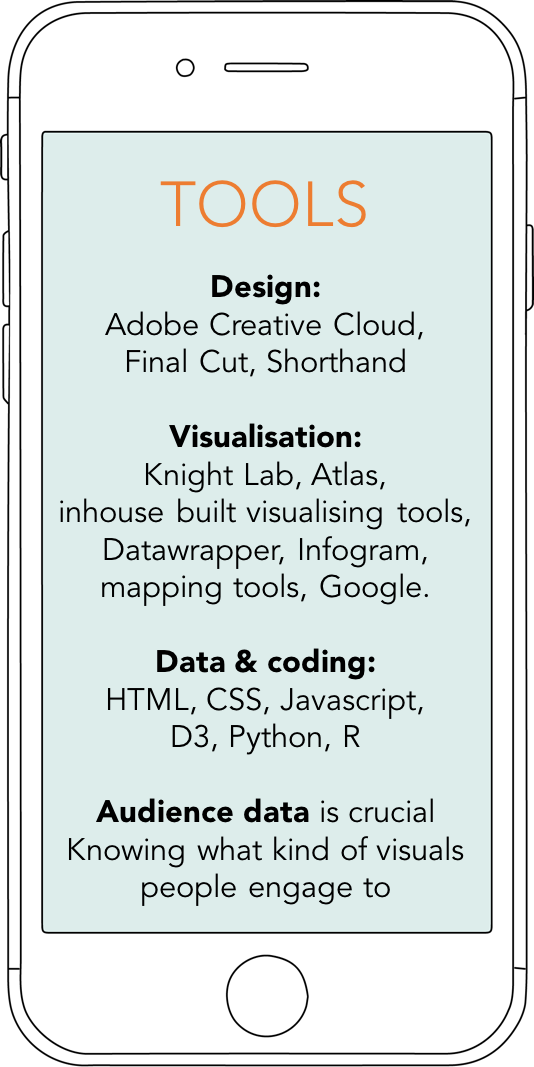
Newsrooms started creating their own CMSs (content management systems) to be more flexible and not dependant on third party software suppliers with their publishing. The Guardian, The Times, Washington Post and New York Times have developed their own in-house CMSs. These systems enable fast publishing and also agile development. Inside CMS there are also tools for journalist to make their content richer on the go.
Outside and often open-source and free-to-use tools have also helped newsrooms add more visual elements in their storytelling. The most used among the interviewed newsrooms were Northwestern University’s Knight Lab’s journalistic tools, Datawrapper and Infogram.
One of the tools that requires no coding experience, but creates highly visual storytelling, is Shorthand, which has become a broadly used visualising software in newsrooms. Among the costumers of this Australian online based software are, for example, the BBC, Telegraph and Thompson Reuters Foundation.
Its popularity grows all the time and it also defines the look of long-form visual storytelling. The basic model now for a visual story is being highly visual and using so called parallax swiping function to transform from text to a visual element. The reader only needs to scroll or swipe and the result is highly immersive and visual, which is one of the reasons for its popularity. Chartbeat also analysed that five out of the ten most successful long-form stories in Britain were made with Shorthand [7]. [1] Global Mobile Market Report 2017, Newzoo. [2] http://www.digitalnewsreport.org/survey/2018/overview-key-findings-2018/ [3] https://digiday.com/media/nbc-news-daily-snapchat-show-now-4-million-subscribers/ [4] https://developers.googleblog.com/2018/02/amp-stories-bringing-visual.html [5] https://reutersinstitute.politics.ox.ac.uk/sites/default/files/2017-07/Brand%20attributions%20report.pdf [6] https://www.nytimes.com/projects/2020-report/index.html [7] http://2017.chartbeat.com/intro